Fresh communication in the world of industrial real estate investments.
Fresh communication in the world of industrial real estate investments.
Accolade is proof that even in the conservative segment of investment funds, a brand can feel modern, positive, and still trustworthy. The logo we created back in 2011 continues to work seamlessly across all markets and media to this day.


Introduction & Challenge
Accolade approached us as a small company with just a few employees, looking for a professional identity to enter the industrial real estate market. The goal was to create a brand that would earn the trust of investors, partners, and municipalities while clearly standing out from established competitors.


Solution & Process
We designed a timeless logo composed of a typographic wordmark and an original symbol. The symbol carries hidden meanings while maintaining an open and friendly feel.
We focused on simplicity and precise craftsmanship, which resulted in a logo that is easily scalable, memorable, and still relevant more than a decade later.
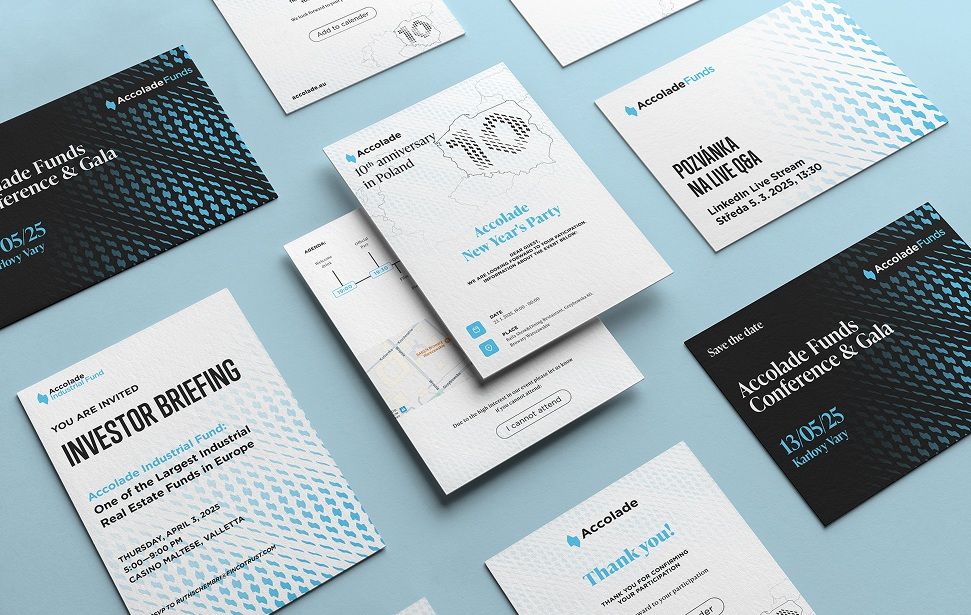
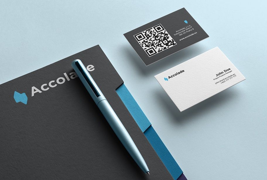
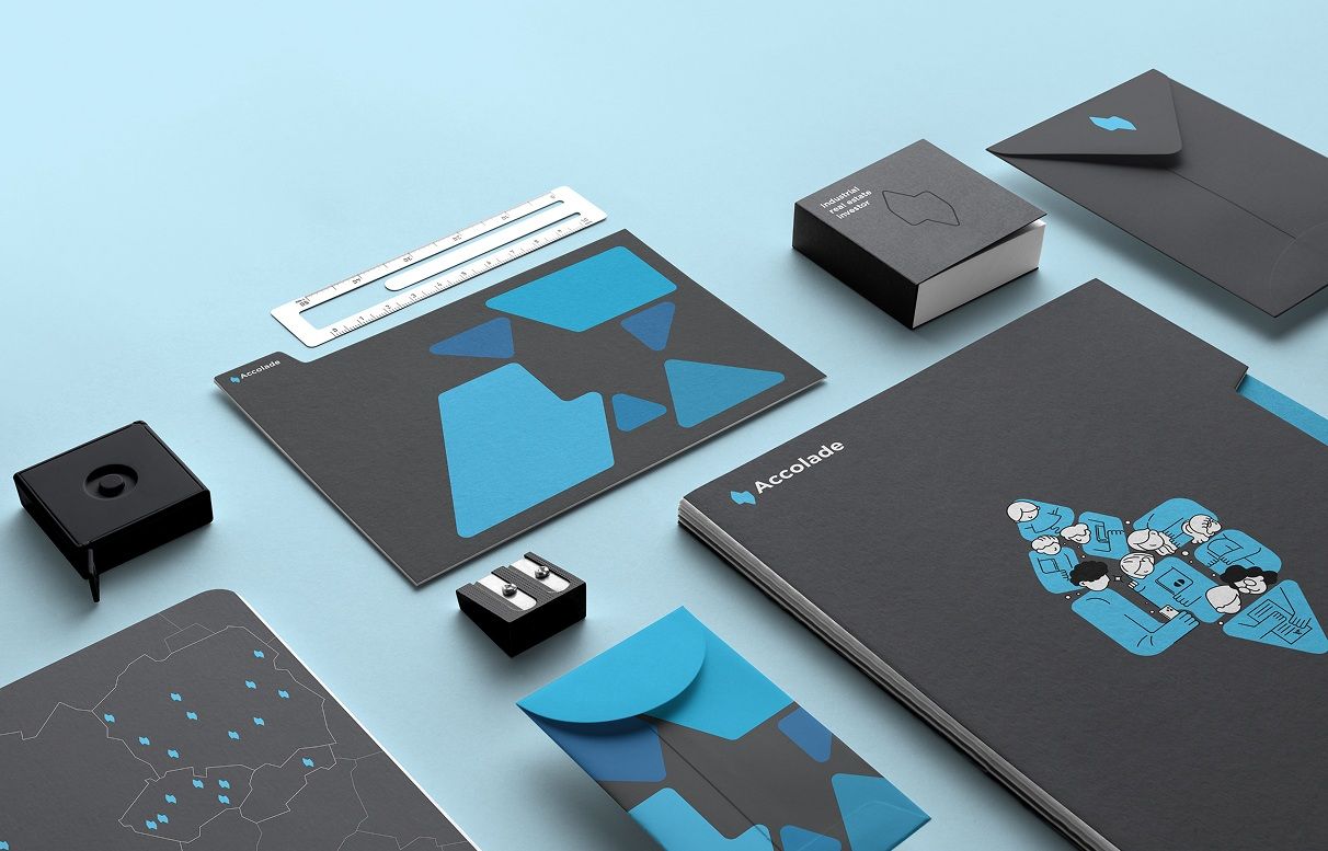
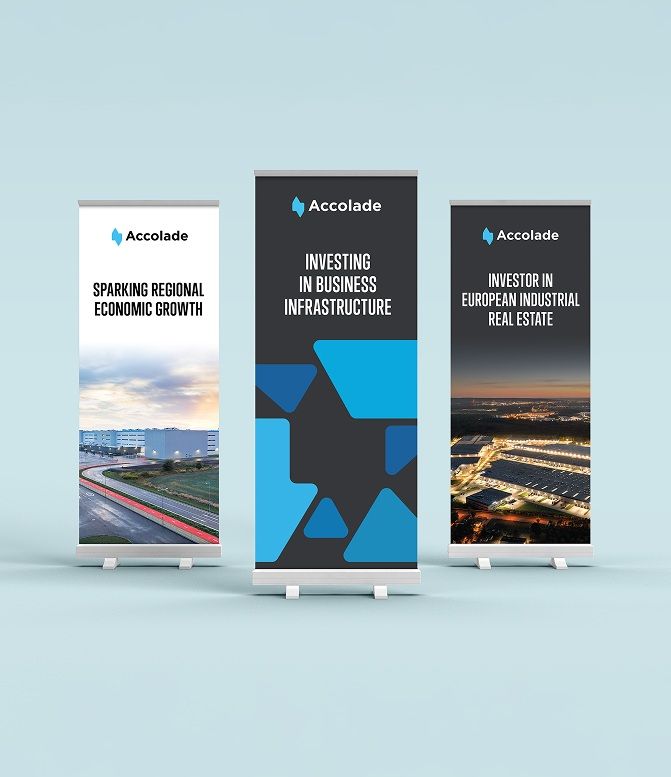
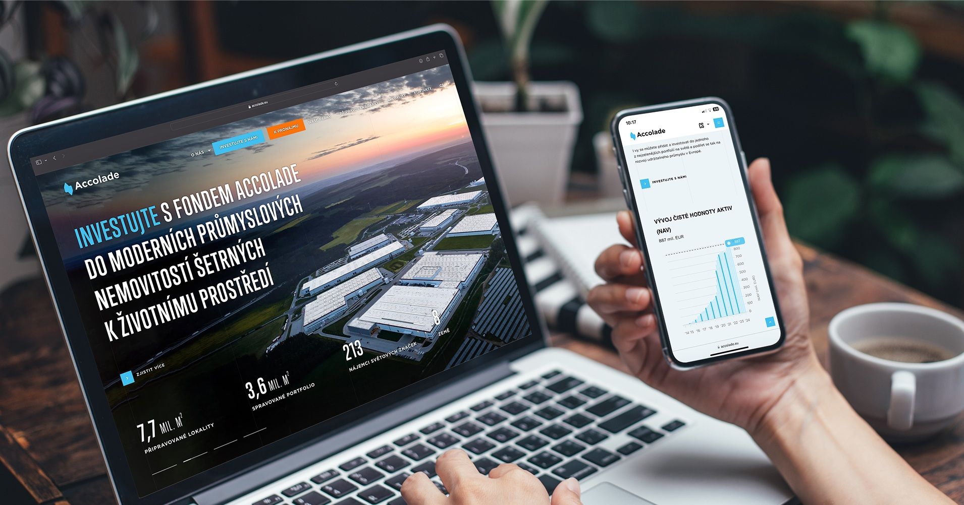
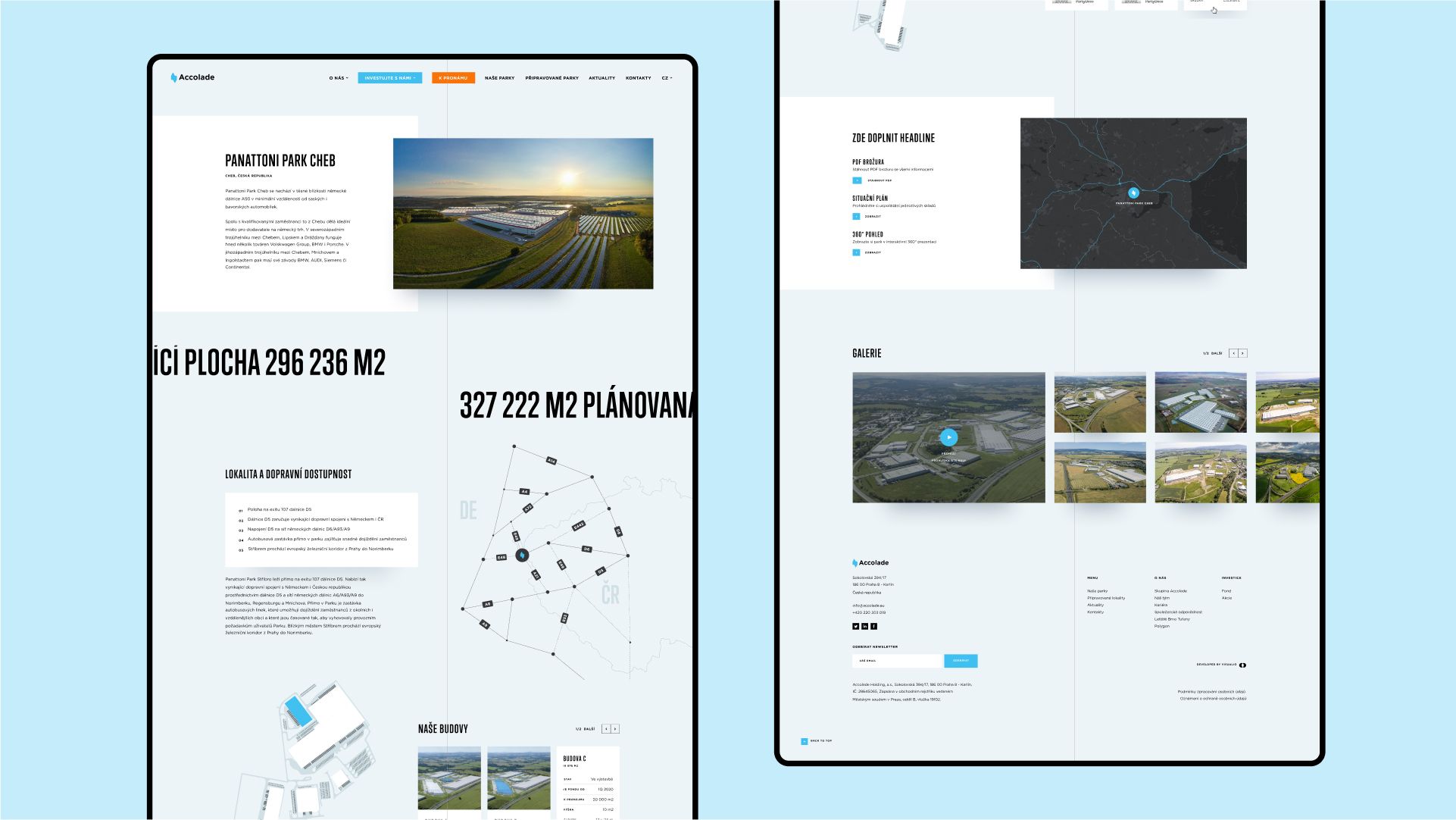
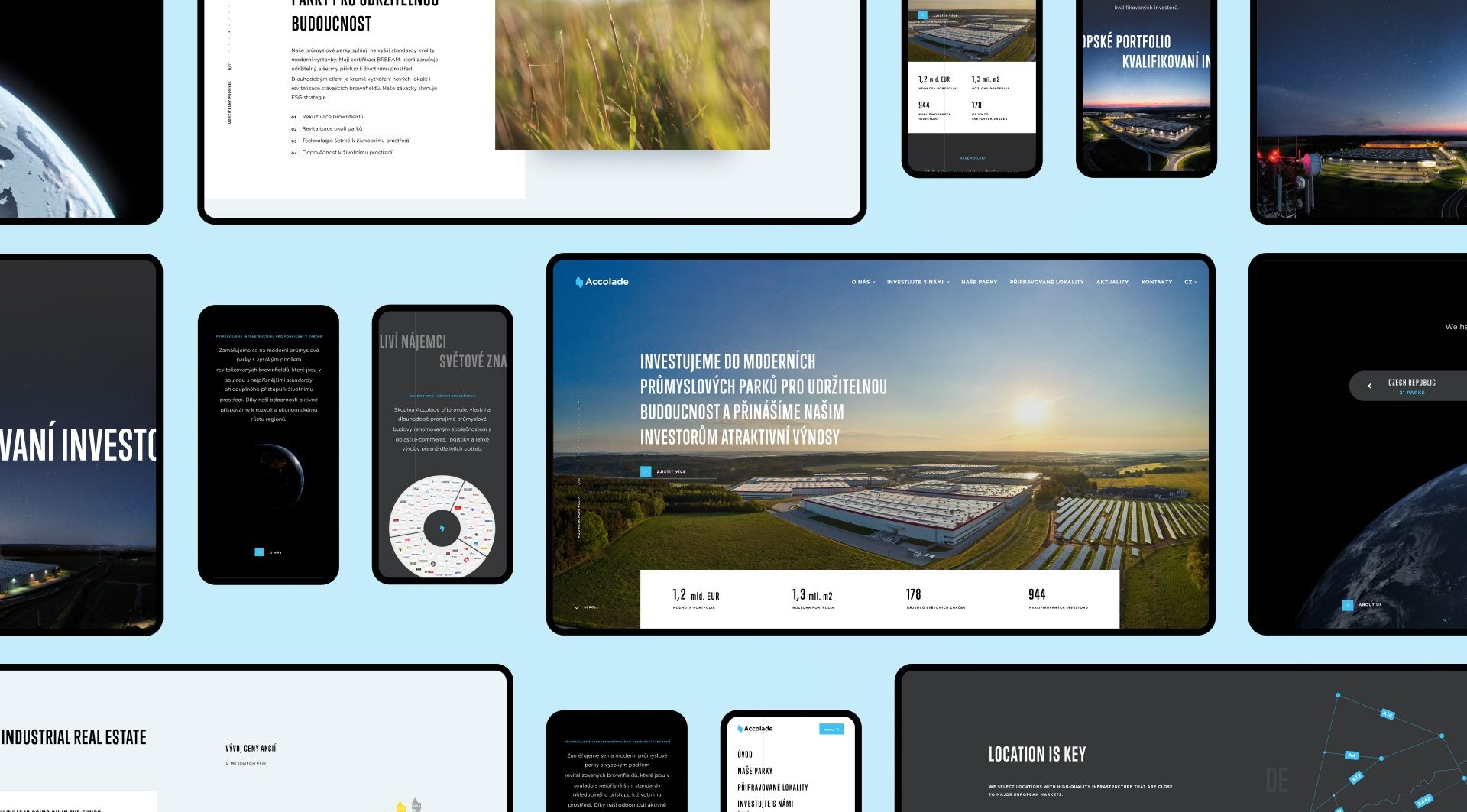
Over time, we built an entire visual system around the logo, from print materials and the website to presentations, events, and branded merchandise.
Outcome & Impact
Today, Accolade is one of the key players in the field of industrial real estate in Europe. With over 200 employees, the company operates in nearly ten countries and manages investments worth billions.

Visualio has been our partner since the very beginning of Accolade in 2011. Thanks to their creativity, professionalism, and flexibility, we’ve become a strong, consistently communicating brand across every channel and every country we operate in.
Milan Kratina
Accolade

Outcome & Impact
The brand we designed has withstood every test of growth and expansion — and proven itself. Nowadays, Accolade is a benchmark for communication in the industry and our logo is a proof that high-quality branding has the power to grow with a company and support its ambitions in the long term.
More projects
you might like