Investments that connect real estate, technology, and tradition
Investments that connect real estate, technology, and tradition
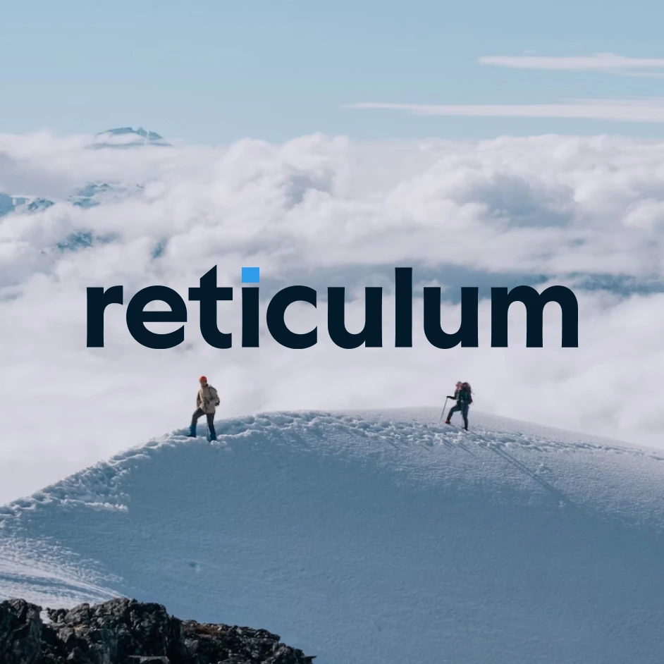
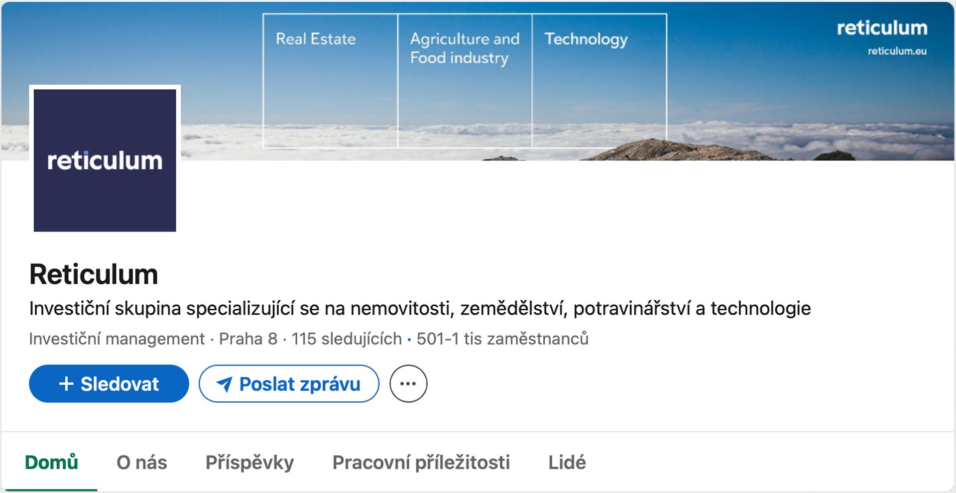
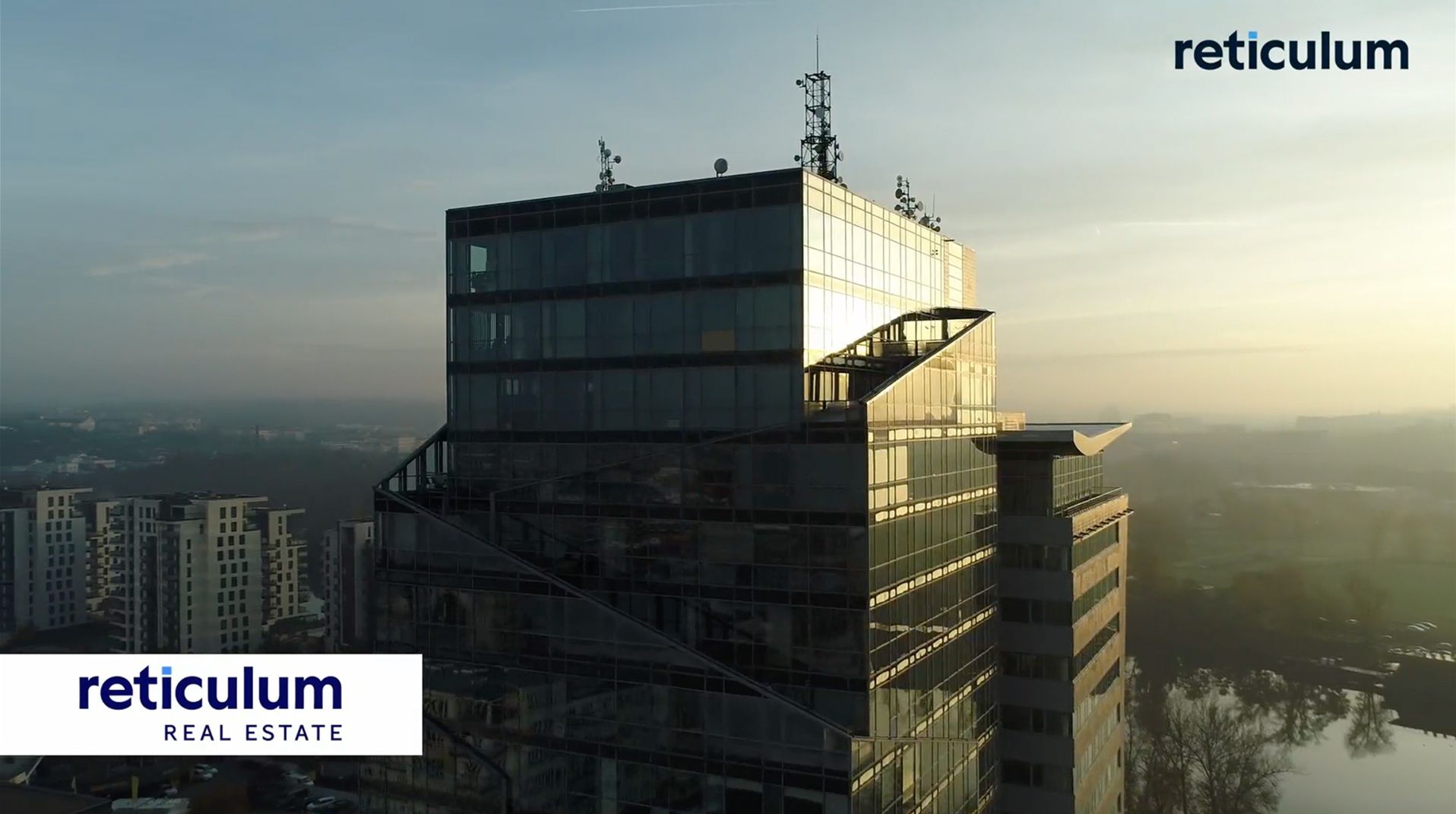
Reticulum is a financial group investing in real estate, agriculture, and technology. As part of their rebranding, we created a new logo and visual identity that reflect their stability, experience, and openness to new industries.
Introduction & Challenge
As Reticulum expanded into new sectors and began to define its public image more clearly, the need arose for a visual identity that would reflect its international ambitions and strong reputation.
Our task was to create a new logo and a foundational visual style that would feel trustworthy, confident, and timeless.
Solution & Process
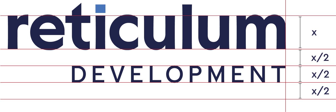
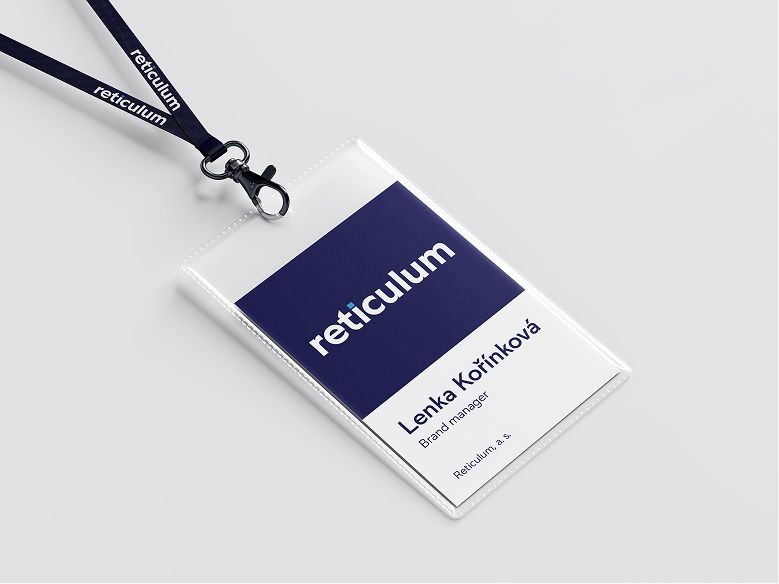
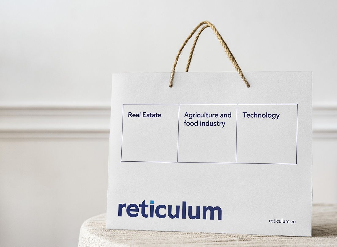
The core of the new identity is a logotype set in the Left typeface by Heavyweight Foundry, customized to maximize visual stability. Its subtle serifs add a sense of credibility while nodding to traditional values.
We retained the square symbol from the original logo, now reimagined as the dot above the “i” — a refined reference to the brand’s origins.
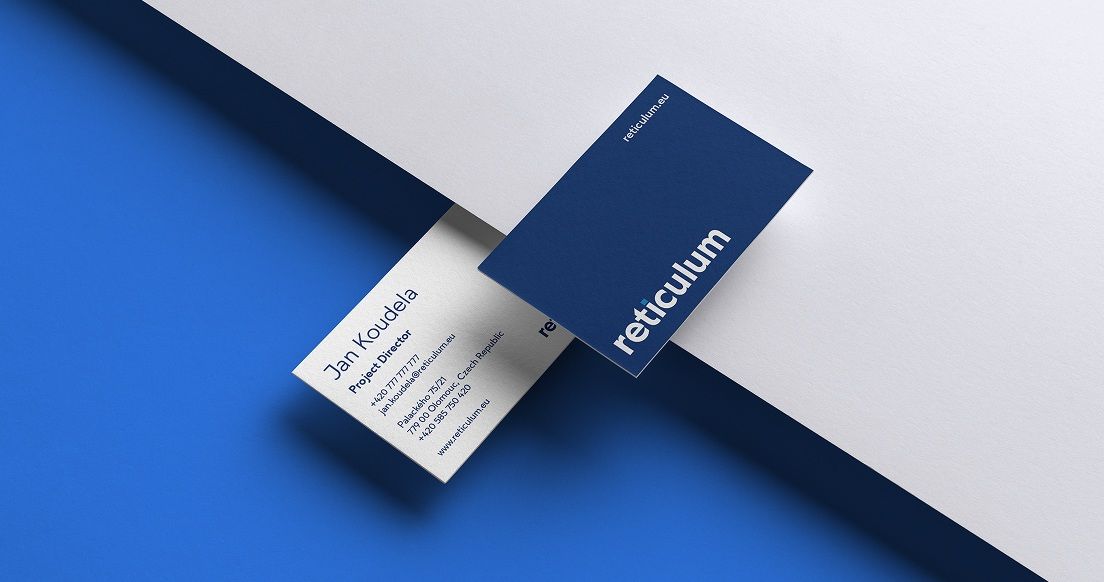
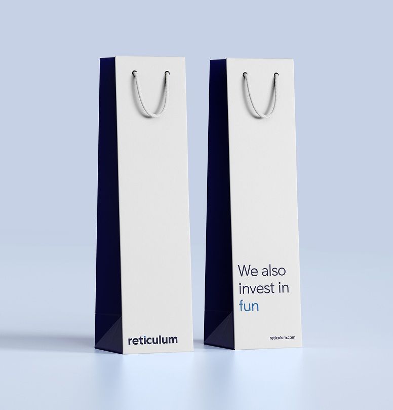
The identity package also included a complete logo manual, business cards, merchandise, and other everyday print materials to support consistent brand communication.
Outcome & Impact
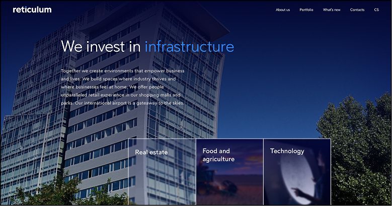
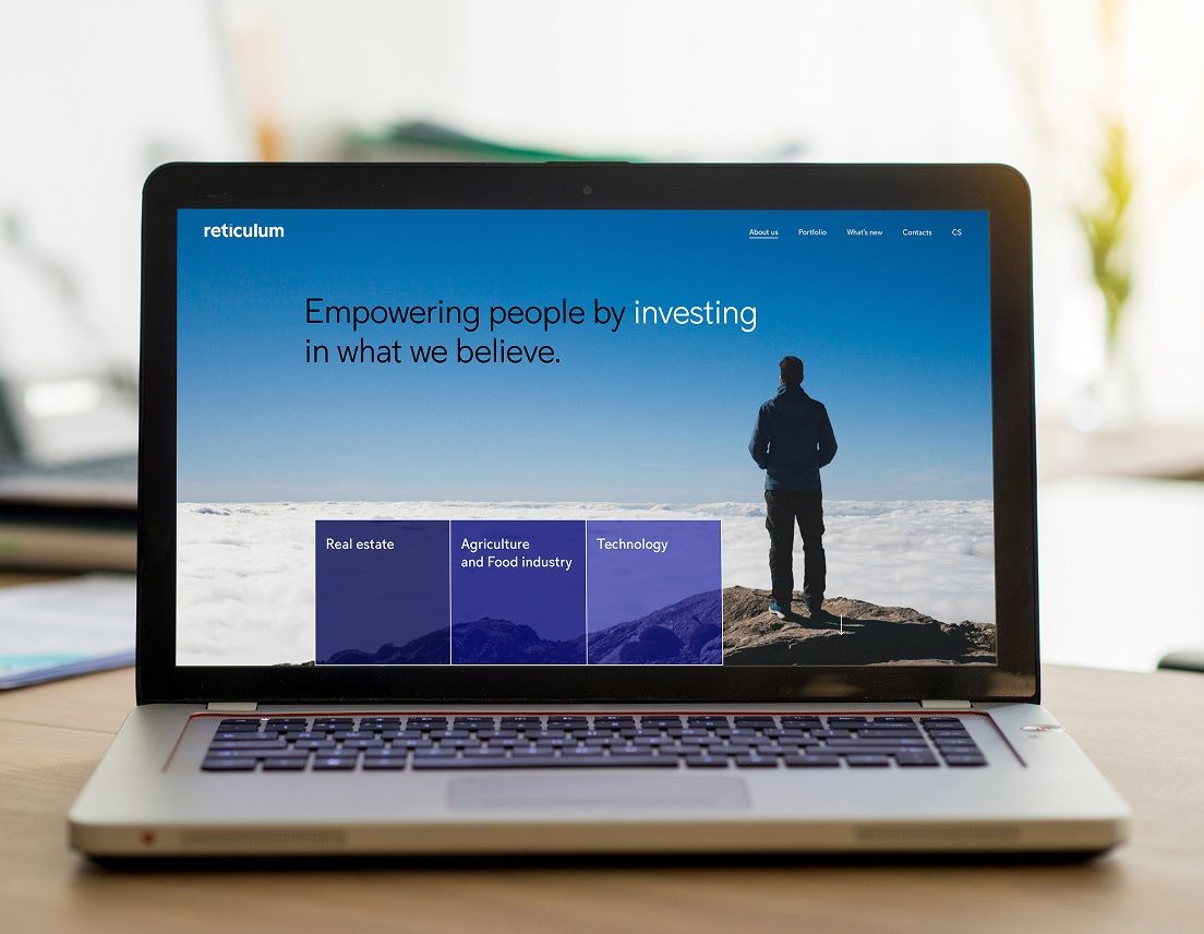
The result is a modern, balanced identity that communicates strength and trust without unnecessary flashiness. The new logo is clean, stable, and easy to apply across both digital and print media.
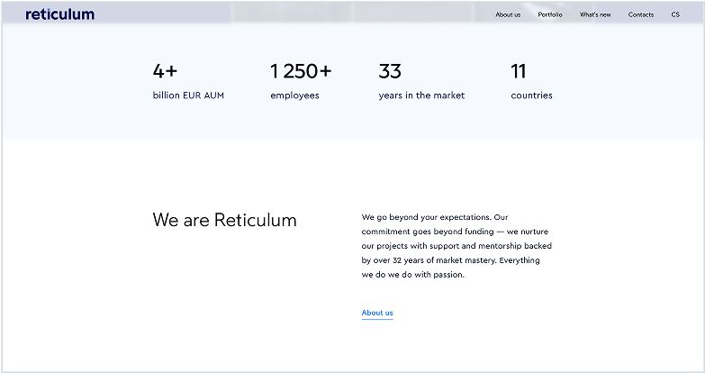
Thanks to the rebrand, Reticulum now presents itself consistently across all touchpoints, from the website to business documents and in-person communication.

We chose Visualio for our Reticulum brand identity because we loved what they did with Accolade. The result is a strong visual style that perfectly captures our brand. The collaboration is always professional and delivers results.
Zdeněk Šoustal
Reticulum
More projects
you might like